Stationary

If this doesnt work i could even mesh the too ideas together and maybe use half of a wolfs face straight on and then put a sensor or lens in its eye or have a lens coming out of the eye and have text where the other half of the image should be.

822c27301ba068d716453d8ec5a2d6a1 89753f4d9458eec49d7afed8f5a6ebce Anthony-Fiorin-logo

If i then cant use a wolf id go for something like a camera related image or logo maybe an outline of a camera or a lens, sensorĀ orĀ just the reflection you sometimes get off a lens when the light hits it.

images-2imgresimages-1dl03 images Wolf-Logo-Designs


I then started to look for some imagery of wolf logos, if i have to use some form of imagery id like to use a wolf with my logo design mainly because i think they just look really really good and would fit well with how id use it in the design. I wouldnt want to rip an image from the internet and i dont have a wolf on hand to draw or take pictures of, but i do have a malamute that looks a lot like a wolf. i could take some photos of him and put them on my computer and use his head or body shape as a base for my wold logo and then use some wolf photos as reference to make adjustments to his natural shape to make a more wolfy looking logo. Am thinking of using images that are straight on of the head so ill have the main head shape with the ears and a bit of the snout. if i cant make that work id have a full body image almost straight on to the front of the wolf so you can see a bit of its back and tail. id also have a side on of the head to maybe with an open mouth id test both open and closed first see what looks best.

Screen Shot 2014-09-09 at 13.05.59Screen Shot 2014-09-09 at 13.02.55Screen Shot 2014-09-09 at 12.56.08Screen Shot 2014-09-09 at 12.55.00Screen Shot 2014-09-09 at 11.40.03Screen Shot 2014-09-09 at 11.13.52Screen Shot 2014-09-09 at 11.16.47Screen Shot 2014-09-09 at 11.34.49ceft-and-company-new-york-agency-dl-fit-iphone-app-daniel-loigerot-07DL_logo-1dl_logoWeb


For this project i have to design my own logo and stationary. I was thinking of using my initials for my logo but i think i will move away from this idea because i dont think it makes for a good looking logo i think it will be plain and boring. Ive looked at various fonts for this logo but i think they wont be a main feature of the final logo if possible.

Student Magazine

For this project I’ve beenĀ tasked with developing and designing 2 magazine covers and 3 features based on things about Sheffield. I began by brainstorming names that I thought would attract the public to pick up and read the magazine. Based on the content of the magazine I decided on the name Ā NV, by using only two letters and making my title short it has allowed me to have more freedom typographically. also the meaning of NV could be interpreted differently by all kinds of individuals, so I am putting no boundaries on my marketing audience. Making it diverse and appealing to all.

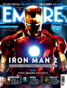
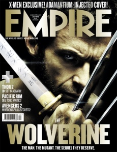
I want my magazine to be based mainly on night life and things such as festivals and club openings and other things of that nature. This means i’ll probably have a very contrasting theme with very vibrant colours on a dark background. (list some magazines that are like this that you may have been inspired from) One magazine that i took inspiration from was Empire magazine. i like the layout of there magazines. They always have the mast head centred at the top of the magazine and then the title of the main film featured towards the bottom also centred but slightly smaller which is a nice use of hierarchy while also keeping the title of both magazine and film separate and clearly visible. The imagery used in the magazine covers really tie the whole thing together with the placement used such as imagery overlapping text to create a sense of depth Ā and how the colours are incorporated into the typography.

37852 73267

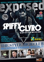
The next magazine i looked at was exposed magazine it features news, music, movies, fashion, food&drink and culture, i also like what they do with this cover. Everything is on a slight slant but is also centred like Empire magazine. they have there title at the top of the cover the same as empire but they change the title of the main feature. They place it in the middle of the cover and have other features at the very bottom of the magazine also at a slight slant. They use imagery the same and add depth through the overlapping of type and text but also use banners to distinguish between different features. The overall theme of the magazine is very dark with i couple of light elements to it in the form of type.

EXP_March_2013_Cover

This magazine will be marketed to a younger audience around student age, i have made this choice because the majority of people that are out clubbing or that attended festivals are students or young people around student age. this will affect the design of the magazine in the sense that it it will need to feature bands music and events that people of this age bracket would want to attend, see or read about. this will also affect the magazine aestheticly, the magazine will ave a very modern young and fresh look to match audience that may not appreciate old styles of design, i want to keep the magazine looking new and current to match the information provided in it.

Names

Envy (spelt NV)

This is the name ive come up with for my magazine. I’ve chosen these names because they are all related to the clubbing scene in some way. I think am going to go with the name Envy but spell it NV. Ive decided to spell the name NV, i made this spelling choice because it allows me to make the header as big or small as i like n really allows for some creative freedom and overal just looks cleaner and makes for a better logo.

Front cover

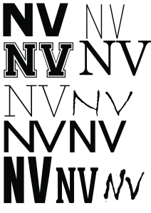
i sampled a few different fonts of various different style even though i had in mind what i wanted from the beginning. i thought it couldn’t hurt to try some unconventional fonts for what i was doing n i might even find something that works really well that maybe i thought wouldn’t. i ended up using ONRAMP which ive never used before but i loved the look of it and the boldness of it worked very well too because of the design being a negative space logo.


NV development

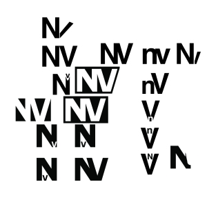
i came up with a few different designs for my logo and enjoyed it trying a lot of different designs i didn’t really struggle much finding ideas and thought i came up with a few successful designs. when i made my final design i knew it was the one i was going to run with straight away it just looked clean and professional without being to plain, i could also use it in a few different ways and it work nicely. i really wanted to come up with a negative space kind of design that could be out over an image and the background image would contrast and fill the logo out which will keep the logo fresh for issue to issue because you’ll get multiple colours and textures filling it with different covers. i felt that a design that merged both letters will work best since it is only two letter they’ll cover more space if they are merged together and then make the logo more visible and easier to read. i linked the two letters in different ways to try and add different shapes to the logo and different looks to it but they was only one way the really worked well and stood out from the rest. that was the design that i decided to use and was the simplisted one, i just brought in the kerning until the letters joined ad then put a black box around it all and then selected the letters and punched em out of the box which gave a template of the logo which i could just overlay on images.


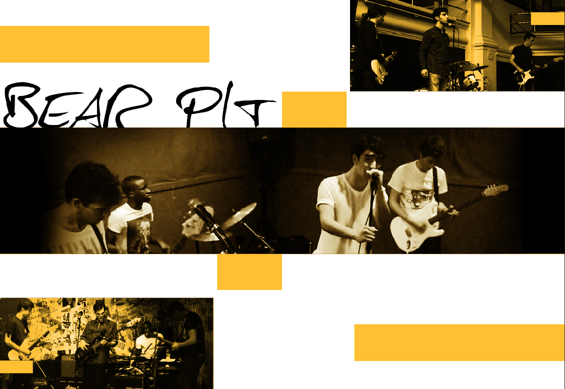
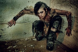
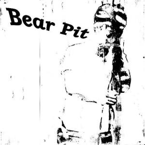
The first feature i want is of my cousins band Bear Pit. They are a relatively new band Ā but have done a few gigs and have a few songs out that are good and need some exposure so i want to feature them and take some photography for them and possibly design a logo for them and do some album artwork. Am thinking of black and gold or a black and copper colour theme for this spread with either a very scratched n grungy design or a very clean minimalist design depending on what i do with the logo.

11871_828658640480814_353218703_n10262111_840045142675497_5589198323533577987_n1965569_840049369341741_1748716796500090554_o

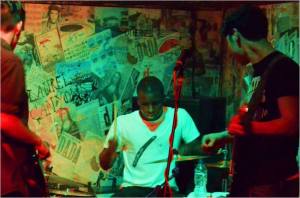
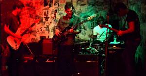
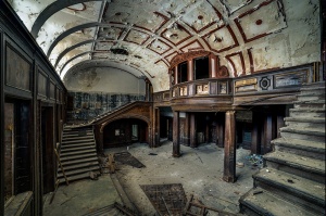
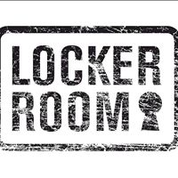
The second thing i want to feature is the opening of Locker Rooms in town. It was an old club that was shut down but then has been reopened and rebranded into a sports bar.’The Locker Room is Sheffield’s biggest sports bar. Situated in the heart of the cities nightlife capital – West Street.Ā Boasting 34 screens, a giant projector, your own personal screen in the booths, English & American pool, table football, ping pong, arcades and much, much more!’For this spread i will probably try to match the sports theme and go for white lines to simulate lines on a football pitch or tennis court ect. I will probably have a dark background with images of the building itself and pictures inside if i can get them. Ā  Ā  Ā I will focus mainly on the new facilities and any information i can find about the first night how it went, i was also there myself so i can add my own experience of the first night. i will also show any offers that will ongoing in the near future and probably place then in the design as a sort of flyer and that people give to you and maybe even take a picture of someone holding one and put it in the design as if someone is handing it you while your reading the mag.

10313367_677309318973652_56418272700709603_nVPlogo1

I decided the third thing id feature is Sheffield band Arctic Monkeys ill probably put them on the cover and have a interview with them featured inside. everyone knows them and they are from Sheffield so it kills two birds with one stone.

I started to gather resources for my magazine such as imagery, info, icons and textures for my magazine such as fonts images i looked at layouts lots of different covers and styles of designs so i could come up with a few varying designs and experiment with different techniques.

arcticmonkeys-4918 instagram-logo-kgo

I tried to use my images as the main theme of the spread and work to the colours already there in the photos i use rather than editing them and forcing them to match a theme i want, i feel it’ll just be more natural and add variety to the spreads. i tried to keep them somewhat symmetrical to keep em balanced but slightly varied things like how many text boxes i used so it doesn’t look bang the same and lazy. i also experimented with having the spreads short n wide to give more of a panorama look n feel to the spread, i feel it works well n looks nice i like the look of it and prefer it but the only problem is its cutting down on your space.

Untitled-1Untitled-1Untitled-1Untitled-1Untitled-1Untitled-1Untitled-1

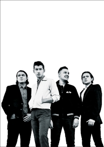
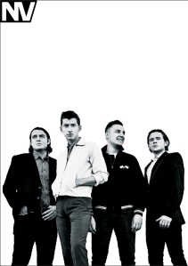
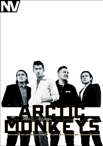
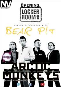
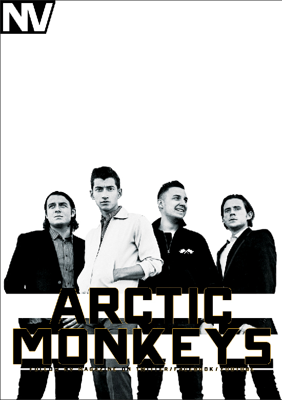
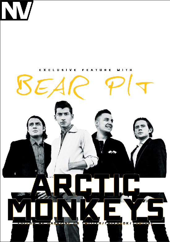
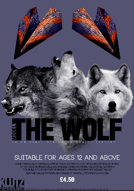
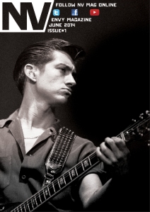
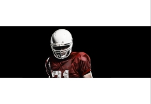
the first thing i did for this cover was bring n my main cover image and find a nice placement for it. i tried the image landscape but it just didn’t fill the whole thing well and was too tall and not wide enough to fit the cover. i then tried the image portrait and t still didn’t fit perfectly so i then decided to just leave a lot of negative space on one side of the cover and id fill this this with text. i then brought in my logo and played with the size a bit until it was visible but didn’t take the focus away form the image, this was the top left hand corner and it fitted nicely because the right hand side is at a slant and just doesn’t work in the right hand corner. i then added text over the Arctic monkeys image for there feature. it didn’t show up well because it was black text on a dark image so i added a gold stroke around the edges of the text to try and separate it from the image below it. this worked to a degree so i added some white bares behind the text that was thick enough to separate it but small enough so it didn’t look like a text box behind it. the next step was to add the Bear Pit text and i just kept this simple and centred above the Arctic monkeys image. i then added the locker rooms logo and text and placed it above the Bear Pit text, this worked ok but it was to squared looking to fit in nicely but i couldn’t find a better placement for it, i tried swapping the Bear Pit text with the Locker Rooms one but it just looked even worse. i moved on to adding little things such as the issue number the month and Envy mag spelt properly under the logo and then finally i added social media icons on the bottom on the cover under everything else.

Untitled-1Untitled-1Untitled-1Untitled-1Untitled-1Untitled-1Untitled-1

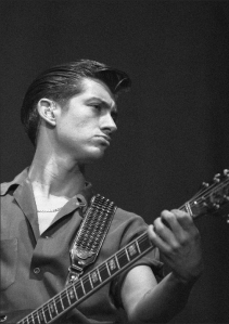
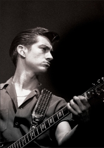
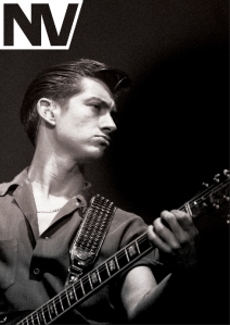
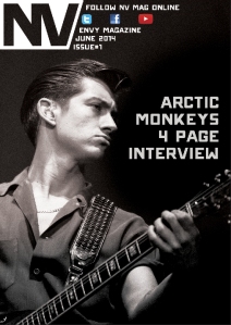
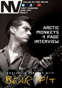
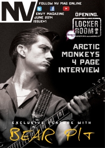
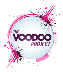
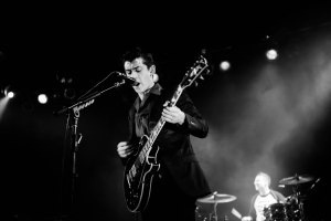
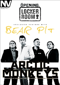
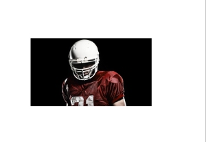
i started this design with an image i found on the internet of the lead singer from Arctic Monkeys, i filled the cover with the image and then edited the image i added some contrast to the image with a curves adjustment and then a unsharp mask to sharpen the image a bit and finally i darkened a few areas where am going to place text to increase the contrast between the off white text and dark grey background. i then brought in my NV logo and for this design i felt white would look best since its going over a very dark image and i placed it in the top left corner same as the previous design except i increased the size a bit, i prefer the size bigger like this i feel it looks better. i then added social media buttons and the magazine info to the right hand side of the logo, i staggered it on the same slant as the logo hasĀ to add some consistency and not get rid of the slant that i put there on purpose. i add Arctic Monkeys text and aligned it to the right hand side so it could run off the straight edge f the page. next i placed the Bear Pit text at the very bottom of the image and i used a thin font so i enlarged it quite a bit and spread it across the whole page. i had a nice little space left for the locker rooms logo and text to go in the right hand corner and then i added the voodoo project logo on the side of it . i like this design i feel its balanced nicely and the negative space it filled nicely without being to cluttered or busy.

Untitled-1Untitled-1Untitled-1Untitled-1

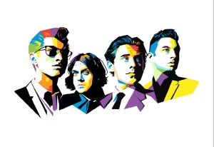
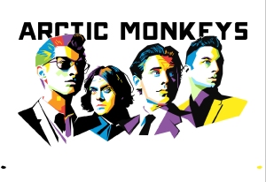
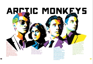
for this spread i found a really nice image online of the Monkeys that has a very nice style to it and i decided to build this spread off of the image which makes it all fit nicely and a lot easier for me because the artist has done most of the work for me. i added a black bold title at the top that i placed behind the image to add some depth but also to keep some negative space at the top of the design. because the some of the image that overlapped is black i added a white stroke about 3 pixels thick around the image to stop the text from merging with it. i added little shape for the page numbers to sit in and just colour picked from the image to keep with the theme of the image used. i then added text into the spread and i wanted the text to run off certain points in the image and like fill in negative spaces in the design to to really make it look like one piece of work. i didn’t know how to use the tool in indesign that did this for you so i manually added spaces where needed and adjusted font size kerning and leading where needed. i then again colour picked from the image the keep the text looking as interesting as the image while keeping in theme. i really liked this spread and felt it was my strongest but the one i spent the least time on, it just worked and flowed really well so i had basically no trouble creating this made i think it was down to me getting a really good foundation with the image i found online.

Untitled-1Untitled-1Untitled-1Untitled-1Untitled-1Untitled-1

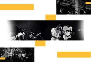
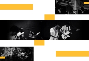
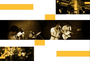
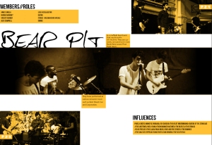
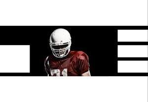
this spread started with a few boxes placed mirrored on each side and then flipped vertically, this was an interesting concept but didn’t work to well i felt. i then added images the same way mirroring and flipping them and then added a main image centred across the middle. the image didn’t stretch across the whole image so i then added a black box under it and faded the edges so the images just looks like it fades to black on the edges, i liked this and felt it gave a panorama look to it. then i edited the photos i added curves adjustments unsharp masks and then a goldish tint to it the images to hide the low resolution and stretching of them. it would have been better for me to take my own images but time didn’t allow me to. i slotted in the Bear Pit title above the main image in black so it would stand out against the white background i like this so i went for black text throughout and added subtitles and text on the orange boxes in a different font to the title. i didn’t really like this design it just didn’t work and looks rushed and awkward, if i did this again id have spent more time on the placement form the beginning and i think things would have flowed better throughout the spread.


Untitled-1Untitled-1Untitled-1Untitled-1Untitled-1Untitled-1

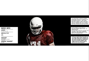
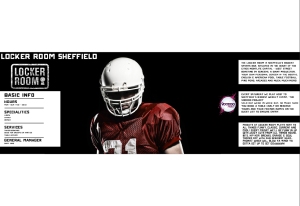
This Locker Rooms spread i wanted to make everything a panorama design so i started with my main image i found online that would be almost centred but placed slightly to the left because of the crease down the middle of the page. the image wasn’t wide enough to fill the whole double page spread so i added again a black bar to the background and the image already had a black background so it fit perfectly so i added a light curves adjustment and an unsharp mask. the image didn’t really need this but i just felt it enhanced it some more. then next thing was to add white boxes, i choose white because it looked like holes in the image which i felt worked better instead of bring a new colour to the design. i then added little lines to split up the text in the box on the left because am going to have features of the club there. after i pit then lines in the text came in and fitted nicely i had a to play with it a little bit to get the spacing even so it didn’t look to cluttered. i then added the Locker Rooms text logo and the voodoo project logo to finish this spread. i liked this spread i think it worked well and i like the negative space, i just feel they be a little to much text in he text boxes.

In conclusion i felt this project went alright i had times where i was excited and full of ideas ad then other times i just couldn’t think of anything and felt flat with my designs and ideas. i think this was because i had alot of stuff going on in m personal life and was either busy or worrying about that instead of concentrating on my work. if i was to do this again i think id be fine and get alot more out of it and have much better out come simple just because my personal life is ok now n i can fully concentrate on my work.

Corporate ID

For this brief I’ve been tasked with choosing from a list 14 companies and then create a new logo design for that company. i decided to go for theĀ PRODIGY which is a sports company (similar to NIKE, ADIDAS, REEBOK etc).

I think ill do well and be able to design something that am happy with and actually like which will then give me more motivation to keep working on it and work harder on the design. I first started looking at the definition of the word prodigy which is:Ā a young person with exceptional qualities or abilities. I want to some how incorporate this but am having trouble thinking of suitable imagery for it so i’ve started looking at different sports to maybe find a silhouetted pose or action that maybe applies to a few different sports. I am not very experienced with illustrator so am finding it hard to get used to using it but am getting plenty of help from Matt with the software. Am still in the brainstorming stage of the work and am just really testing ideas and stuff and trying out new things. One idea am trying is like a heart rate line, am just trying to make it look good but keep it simple but am still considering new ideas. I’ve ended up running with the heart rate idea and white text on a black rectangle around the text which makes it look like negative space. I like the logo design and feel that its appropriate and works well while staying simple. I have then started to apply it to various things to show it in context such as a business card, corporate manuel, letter head and leaflet. i have also shown different variatins in the logo itself such as an inverted version of it and different colour schemes for it.

Cinematography/Video Editing

I really enjoy this style of videography, its interesting or artistic shots of things that are loosely tied together in some way with no narrative or purpose and then a sound track to suit it added over the video. I’ve not really had a chance to try this myself up until recently because ive only just got a camera that can get me some decent video so i will be trying to film something like this myself in the near future but i will probably do a lot more with the editing. http://www.youtube.com/watch?v=bEYo8sLY8Yk http://www.youtube.com/watch?v=8HWmskiyPRg http://www.youtube.com/watch?v=bUpwGcL_32A http://www.youtube.com/watch?v=67sg3S7dZzs http://www.youtube.com/watch?v=fyW3IXf6m3w http://www.youtube.com/watch?v=vBNHrowhTFo http://www.youtube.com/watch?v=WHHqNzr4jwIĀ https://www.youtube.com/watch?v=mgIsOphaJ5w

Advertising and Promotional Design

Screen shot 2014-01-31 at 12.45.27

For this project we have to:

Create a new visual language for The Body Shop’s brand communications that reflects their pioneering spirit within the beauty industry and as a forward-thinking British brand.

Anchored through their window posters, the challenge is to expand from there to form a new visual communication style. Your work should encompass their quirky tone of voice, product efficacy and premium beauty credibility.

I found a break down of the breifĀ http://dc-everitt1215-dp.blogspot.co.uk/2013/11/ougd503-body-shop-brief-breakdown.html

I began by looking at the body shops previous visual language. I did this by going into the shop and then looking at the websites and then adverts.

This poster campaign is about violence against women and not standing for it and that you should let someone know if you know about it going on. This poster has Ā the text “i swear never to commit, excuse or remain silent about violence against women this is my oath” and then has some details about who to contact and whos pushing this campaign against violence against women.

This poster is about racism and is intended to start debates and talks about racial issues. This poster has a yellow background and then a black finger print that has the text “GIVE RACISM THE FINGER” with a picture of someone holding their finger up and their print highlighted in green. And then the text make your mark today under it. Aiming for 40,000 customers to leave a finger print and commit to constructive conversations about racism with friends, family and colleagues. 50,000 finger prints collected.

These 3 posters tackle the issue of women having to look a certain way to be classed as good looking. They use dolls that are not typically made to fit the stereo type of how women should look but use dolls are made to look more like the majority of women in the world that you see everyday. they also then have text that says “There are 3 billion women who don’t look like supermodels and only 8 who do.” I think this poster campaign works well and makes you think by using the dolls that are normally in line with the majority of things you see that say women should Ā look a certain way.

firstruby600

ruby_poster

agedruby

This poster campaign is for endangered species like the hippo and has some imagery. It has an image of upside down portrait of a man and then has a hippo projected on to the person. I think this works well because when i first saw it i saw the hippo first and then after i noticed that it was a strand shade and then realised they was a person upside down in the over all image as well and then i wondered what it was about after that and then looked straight to the tex to see what it was about.

hippo TYPE

This is another poster about endangered species. this time about polar bears. this is conveyed but a bit of text stating facts about the polar bear and how many are left in population and then is accompanied by s photo that has the double exposure effect on it as the polar bear looks like its been overlaid on the image o a girl. this is a very minimalistic design and works well and i will try and follow this same sort of minimalistic design for my own work as i feel this works very well.

Polar Bear TYPE

I was thinking of using different ethnicity’s to represent different products for the advertising campaign but i was wanting to use races that you wouldn’t typically use for that particular product. Hopefully this will work well and the only problem i can think of so far is that the product may not have any features about it that you would attach to a certain race or part of the world anyway. I also had an idea of attaching certain products to places in the world and then replacing that particular countries landmark with the product. Am looking at the different products that will be advertised so i can get a good idea and feel for the style and look of the poster. This helps a lot as most things have a bright vibrant colour to it anyway, but most products come in various flavours and so they are a variety of colour containers.

The idea ive decided upon is to have the products adapted to fit inside the body shop logo and the then super imposed as a tattoo onto a persons skin. the products will all look like a collections of tattoos with just variations on the product on the inside of the logo.

This is what ive come up with for the candy crush lipstick. Am trying to keep up with the floral circular style of the logo

Screen shot 2014-03-21 at 10.44.50

This variation of the design is similar but altered a little. i wanted the center lipstick to be bigger and more prominent to show the product off clearly and i feel it makes the whole thing look more balanced as well.

Screen shot 2014-03-21 at 11.12.22

This design I used the body butters to try and make a nice tattoo design. I kept with the same spherical design but changed the shape a little and put some things on the outside of the body shop logo. I feel it works ok but the item itself is small and a little difficult to see so i may have to try and redesign it in a way to keep the item itself big and then just show the variations in flavour smaller.

Untitled-1


To help with applying these designs to a photo of some one i did some research in how to properly get the tattoo look and effect, i already had an idea of Ā how to do this but felt i should look for any hints or tips i could find to help improve my design. I looked at this video along with others for techniques:Ā https://www.youtube.com/watch?v=C22J1-c_FMk

Schedule

week one i started my research Ā looking at other add campaigns for the body shop and looked at why they was good and worked and what i should include

week two i then looked at age groups Ā and the type of people that would be looking at my poster such as gender and the amount of income they’d have

week three i started some basic ideas and and tried to get some layouts and info that id include in the final designs

week four i started designing the posters and putting all the pieces together in a way that worked best i then evaluated my designs and spent the rest of my time on annotating and other written work.

Conclusion

my designs where simple and i think worked well and got the information across that needed to be got across. if i had to do this again id probably just spend more time coming up with ideas because i struggled at this part again same as in other projects and it seems if i cant get a good idea at the beginning it just throws me off for the whole project.

15 Minutes Of Fame

Screen Shot 2013-11-19 at 11.33.39

To generate some ideas i made a brain storm of things i could think of that people use everyday, i came with general things that was ok but nothing that sparked any creativity. I then talked to Mike for a while and we came up with the idea of using my great granddad and sitting him down and seeing if he can tell me any stories about his time in the war. i then got thinking about the actual 2nd word war itself and thought why did it happen and what was the out come and then i thought maybe i should just look at some of the biggest wars or an unusual one and try to turn it into a positive thing and like look at the outcome of the war and what things would be like if they was a different out come. so for example if the nazis won we could still have concentration camps and still have the discrimination that was around then. i then decided to thing about equipment and things that soldiers carry and use everyday but the only thing i could think of that every single soldier would use or has is dog tags. i then had a talk with my tutor Matt and he told me about a machine thats not as well known as all the famous battles and things that went on in world war two. that was the Enigma machine and it was made to decrypt Nazi communications so that we was one step ahead of them and played a key role in winning the war. i looked at key features of the machine like the keys on the machine and the font type that it uses and also what and encrypted message looks like.

449px-EnigmaMachineLabeledenigma-keyboardfullhires-wehrmachtkey-bgs100_2967

I then looked at some fonts for this theme and started naturally with typewriter fonts. Some of these where nice but they all look the same but vary slightly in the amount of ink spillage the machine leaves on the paper i picked out the one i think looks the nicest and found another font that uses a stencil look that keeps with the military feel so goes well with the last font although may look a bit to modern to be used in conjunction with the first one. i then found an old ww2 font that was used for headlines on news papers. its very thick and bold but has scratches and imperfections in it so it still fits in well with the theme and first font. i will likely use this on very little and stick to titles and headings for it and then use the first font for the bulk of the text.

Screen Shot 2013-11-20 at 10.56.11Screen Shot 2013-11-20 at 11.07.41Screen Shot 2013-11-20 at 11.22.35

I then began to look at world war two medals uniforms and colour themes for some inspiration as to how i could present the piece of work in a style appropriate for my subject. i wanted to find things from in and around the war but i didn’t want to stray away from the main subject which is the enigma machine but i want to take inspiration from the things that influence it. things look very old and weathered from the war and generally have imperfections on them and are faded or damaged in some way.

D11-30-11 (27)Replica of Audie Murphy's medals from WWIId1630557r

So for my design I’ve decided i want to make an old fashioned dossier for the Enigma machine and show some information on the Enigma machine and then show some information about the war and some information on the code breakers that worked against the Nazis to help gather Intel for future operations. i am going to present the information in the form of around 5 post cards that contain some information on the back with some light vector work and typography and then on the other side i want a main photo with some little hand written notes on the image or on the sides of the photo somewhere. I will also have a little typed out letter in the back of the dossier folder which will be in code and then i will also have a decoder to go with it that will have holes in it which when placed over the scrambled latter reveals a hidden message, I dont know what the message will be yet but it will probably be a congratulations for cracking the code and then some sort of offer to get money off. The individual post cards will all focus on different things such as the Enigma machine itself, the creator of it, the code breakers that work with the machine to crack the codes, the impact it had on the war efforts, capturing the machine and Bletchley Park itself. I want to give a brief overview of everything they on the cards so that someone with no knowledge of the Enigma machine will know the general story after they have read the postcards. They is also a film about it called Enigma that i may watch to get some more information on the subject.

the_dossier

i started researching information for the post cards i started with Bletchley park. I found more than enough information about Bletchley Park during the war time and now so i actually had to just pick out what i needed and just use that instead of having to look really hard to find some information which is what i thought id have to do. i found a lot of images of the front of Bletchley Park but they was all the same angle so i found it hard to find some variety in the images i used but i found an old plan of Bletchley Park which is just a black n white plan of the building with notes on where things were which looks nice i may add some hand written notes and replace the typed ones to give a more authentic feel to it.

bletch_map_bw bletchley_park

I then decided to start on the Alan Turing card. I found out plenty of info about him to do with project enigma and just his general life. I wanted to feature lots of other information about him but i had to really just stick to the important stuff because i am working with limited space and cant get all the information id like on the post card so i really had Ā to just look for the key project enigma stuff and then arrange that in a way that its a decent size and i have as much as possible on the card. Finding imagery was kind of difficult for this card. i found an image of a statue that has a very straight on pose and i wanted to find a real photo of that to merge with t but every real photo of him he is turned to one side os it never matched up. so i used the statue for the front with some light type and then used the real photo for him on the back with the information about him.

4484122900_3452070e48_o alan-turing-photo

I then moved on to the Enigma card and found it easy to find imagery for it. They is lots of pictures floating around the internet of enigma machines and parts which are a nice high res image so nearly all of them are useable. I used an old original image of the enigma machine for the front of the card and added a little bit of text and then for the back i used to the enigma logo that i lifted about of the image below and then colour over laid to fit in the image well. i then added some text to the back to tell some information about the Enigma machine.

enigma-8-rotors-1000px mzl.vaewpvxa

I then moved on to the next card which was Arthur Scherbius. This card has been the most difficult so far i couldn’t really find any images of him except one which i used for the front of the card and even then it was a very low resolution image so i couldn’t really do as much as id liked to with it. i felt as if had to just stick it very neatly in a corner or very central, i really didn’t do much editing to it either i just added a slight bit of contrast using the levels adjustments. I couldn’t then find a 2nd image for the back so i decided to just try and find his company’s logo to feature somewhere in a blank space on the card but i couldn’t even find that. i did some more searching and found a very nice image of 3 cogs from the Enigma machine so i decided to feature that as its his creation.

Enigma-rotors scherbius

Before going straight in to editing the photos i first looked at some ww2 photography to get a sense of what authentic ww2 photography looks like and also to make sure i don’t make the photography look to edited which will give it a modern look. I also have some modern photos so I can see that I will probably have to damage the photos in some way to give the old feel to them. A problem I’ve run into with editing old photos is that most pictures have some sort of softening on them due to things being slightly out of focus so i try to use an unsharp mask to counter this but it then brings out all the noise and grain in the image. Most photos are very flat and have generally a very grey feel to it so you need to always add a levels adjustment to it to get some sort of depth.

GUADALCANAL ugc11388312


Overall i felt this project went well. I’ve never tried to work with something this old before and feel i did well with it, although i wanted to give things a modern edge to them when maybe it would have been better to go full old timey on them and add extra film grains and sepia. if i was to do this project again i would have probably just stuck to a different subject sooner so i had more time to work on the project itself and then could put more time into the designs.

Skill Building: Digital Design

For this project i have been tasked with choosing a few different words and then to convey them words through self generated imagery whether it be through photography or illustration or any other means. I started by brain storming words that i like from the list provided in the brief and then started to write ideas on how i would communicate the words visually.

brainstorm

I then looked at examples of other peoples work to try and get some inspiration and see the best way to go about creating my work.

I started with decay. The images i found where generally of abandoned buildings, vegetation and portraits. they was also the odd skull or burnt out car to so i could use and old broken object not just something organic that will actually decay.

7b8c24de26d2534a5d6d9203652c1180-d5xk2b6decay_by_fantasy_alive-d32r0gv56852baeaf4f7a5fab6bdf48dd56210f-d5xb6h6Decay_by_Shinetopjiffy_decay_by_gakb1tch-d2xrz2g

Next i started to look at the word texture. straight away i had an idea that instead of just taking a close up image of something i wanted to maybe try having water and oil in a glass and take an image of how they separate and the oil sits above the water. Am not sure this would work as it is more the thickness of the liquids than the texture of them that makes them separate but i still think visually it will be interesting to look at. when looking for examples i found a lot of different images that where quite literally just different close up texture images of things such as walls, animals, plants/trees, metals and the odd random object.

Texture_by_sugarblonde texture_by_almaclone-d6lj8satabby_texture_by_3thehardway Texture_by_aymanko0o Texture_by_Lavaspawn

The next word i looked at was contrast. I found lots of different images and a lot of creativity going on for this word. I think this is the word am going to have the most fun with and be the most free to do what i like with. i found images of things such as plants, eyes, cups, animals and many more examples.

Contrast_by_red_wolf_spirit high_contrast_by_adderka1-d6i94yv contrast_by_artoffragility-d3i7deotabby_texture_by_3thehardway contrast_by_dicegirl14395-d4w87ug

The next word i looked at was distortion. I mainly found images that had a liquify filter on them or a picture that had been taken through a bottle or a warped reflection. I will probably have a go at this way of showing the word distortion and then try to do it a different and more original way.

distortion_by_bombariderthrough_the_bottle_by_jrisdon13-d421mp9tumblr_lw7hbqwJ1O1qliixao1_1280

The final word i choose was movement. The images i mainly found are actual picture of something moving rather than using generated effects to make something look like its moving, so images use i fast shutter speed which gives a little bit of motion blur and some use a slow shutter speed to give a lot of motion blur to the image but this is mainly used at night with a dark background and then bright lights to leave streaks through the image. i will probably try both methods myself and try to come up with some other way i can do this that i haven’t seen done yet already.

the_movement_of_london_by_loukapics-d324z25 movement_by_RAMMMmovements_iii_by_koukei-d3exmyx2e9661542487ae8a7c3837f5102e659a-d36pph4

These are the first set of images that i took

DSCF3994 DSCF3996 DSCF4002 DSCF3983

I took these images trying to get and image for the word decay at first with the first 3 images and then the word texture for the last image. i still have a lot pictures to take and i am happy with the pictures I’ve taken so far but they are going to need a lot of tweaking and editing to get them how i want them to properly convey the word.

Mould1

For the mould image I tired to take the image close up but in a way that it fills the whole frame to give the impression the wall is over run with mould or decay. i feel it looks ok but i could experiment with a lot of just white wall then a small patch of mould to give a different effect. The effects i applied to this are first an unsharp mask to bring out the details i do this to every image and feel it always makes a sometimes subtle but good difference to the image by bringing out all the details especially on small objects like the mould in this picture. i played with different strengths and radius’s but settled on max strength on a very lower radius of 1.0. i then moved on to editing my curves and and levels. i generally just increase both for a more contrasted image but the background was white so the highlights didn’t need much doing to them but the blacks or mould i increased a lot which really made it look dirty and like it wasn’t supposed to be there on the clean white which was an effect i liked. i then played with the saturation and was going to draw all the colour out and just leave it completely black and white but after doing that i realised that all it did was draw a greenish tint out of the mould that actually made the picture look better so i undid it and left the image full colour. i then left the image at that as i thought it only needed enhancing a little bit.

decay Apple

The next image i edited was the picture of the apple that i also used for the word decay. I start as always with an unsharp mask and some levels adjustments i settled for a small radius again and highish strength on the unsharp mask because the image was nicely focused anyway and it dint need much doing to it. as for the curves i didn’t go crazy as the image was contrasted a lot anyway but i the image still came out overly contrasted because i was planning to make this totally black and white as i thought the red of the apple made it look to healthy and sweet. while desaturating the image i played with the hue slider which made the apple green and then blue. i then had am idea to make everything black and white but then leave a slight tint on the apple and make it some kind of rotten looking colour. i tried the normal red desaturated then i tried s greenish colour then a blue colour but i think am going to go for some sort of a dirty brown colour. I then cropped the image to get rid of some of the background space and to shift the focus more to the center of the image and on the apple.

decay paint

I then moved on to the image of the door with paint scratched off of it. it took me a while to find an unsharp mask setting that i liked because it looked good if you cranked it right up but i was afraid some people would think its to much but if it was lowered to much it didn’t really make much difference so i went for a happy medium with a small radius of around 1.0 and a moderate strength. as for the curves i just added a lot of contrast so the white paint stood out even more from the dark wood.To finish off the image i then rotated it by 90 degrees clockwise because i felt the image worked better that way round and also straightened out the image.

texture fur

The next image i edited was a picture of my dogs fur for the word texture. i might retake this image and had a hard time getting the camera to focus because my dog kept moving around. i finally got a few images and when i looked through them i found one decent one but only one part of the fur was in focus. id rather the whole image have been in focus then i digitally defocus the bits i want myself because id have freedom to change the look of the photo. this has come out nicely though and a strong unsharp mask with a radius of 1.0 brought back some extra focus to the image which gives you more to look at now. i did do much in terms of colour just added a little contrast to get rid of the grey filter over the image.

Designing my plane

to finish up i then made sure everything was aligned and then played with different colours and ordered things in folders. in conclusion i felt this project went well and a really enjoyed it. the only real probably i had was finding some sort of design to put on the actual plane itself. i think this is because its such an odd canvas to work with where the picture changes with perspective alot.

Untitled-1-Recovered

after finishing my plane i then started to work on the typography for the poster to start i just got all the text on the and then started to arrange and play with different fonts and weights. the two fonts i went for is NEOU and Helvetica i choose these font because one is very bold and one is very light so it gives me some varying font sizes that i can use to emphasize certain bits of text.

Untitled-1

to start on my plane i looked at possible things i could have on it such as woods, wolves wolf features and things like that. in the end i decided on a fur texture over the plane so as to keep things simple but then to add a wolfs mask coluring to it on the wings. this gives it a wilt of personality while keeping things reletively simple and clean looking

I have then decided to work on my poster design and with my plane being a wolf design i need to keep with the theme and use some sort of wolf imagery on the poster to. i created a 3 headed kind of wolf image but need to find the best place and size for it to sit. I also need to add the information to the poster to advertise the product properly. As for the plane itself i have just thrown a wolf fur texture over it for now but will add maybe some wolf eyes or something later on.

Screen Shot 2013-10-02 at 10.26.59

I have taken an image from the internet of the plane i will be using and then built up vectors on top of it to create an un rasterised shape of the plane that i can scale without it pixelating. i then added shadows to the design to make it believable ready for imagery to be applied.

Screen shot 2013-09-20 at 11.34.50Screen shot 2013-09-25 at 10.17.39

Ive now finished making my design and adding shadows and highlights to give the whole thing a more 3d feel and look, ive also put them on separate layers so that i can change the colour easily without having to redo highlights and shadows every colour change. I am now designing my poster and seeing which wolf imagery i want to use and trying to come up with a name in the process.